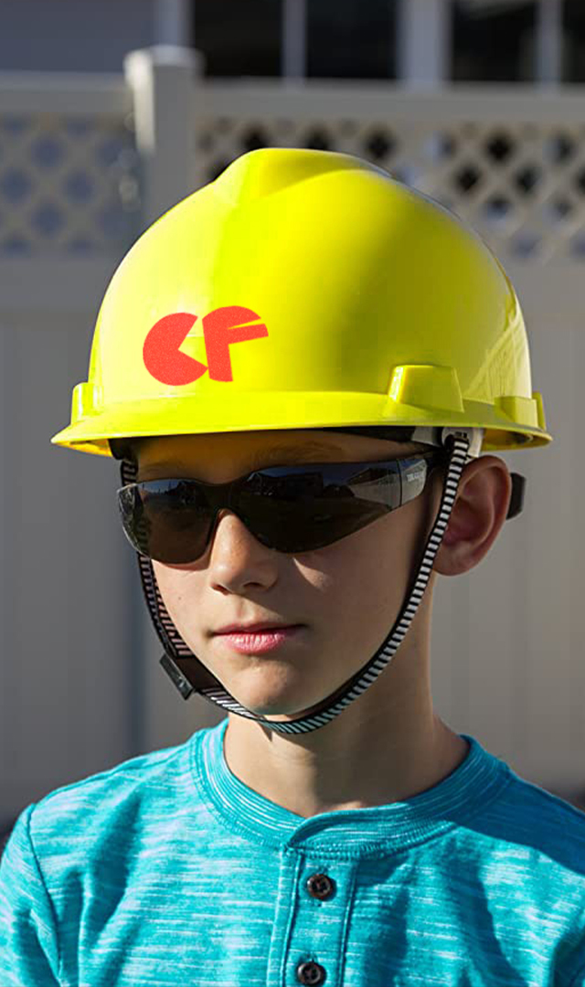
Camp Fire
Brand Identity / Type Design
Recognition: TDC 69 Certificate of Typographic Excellence
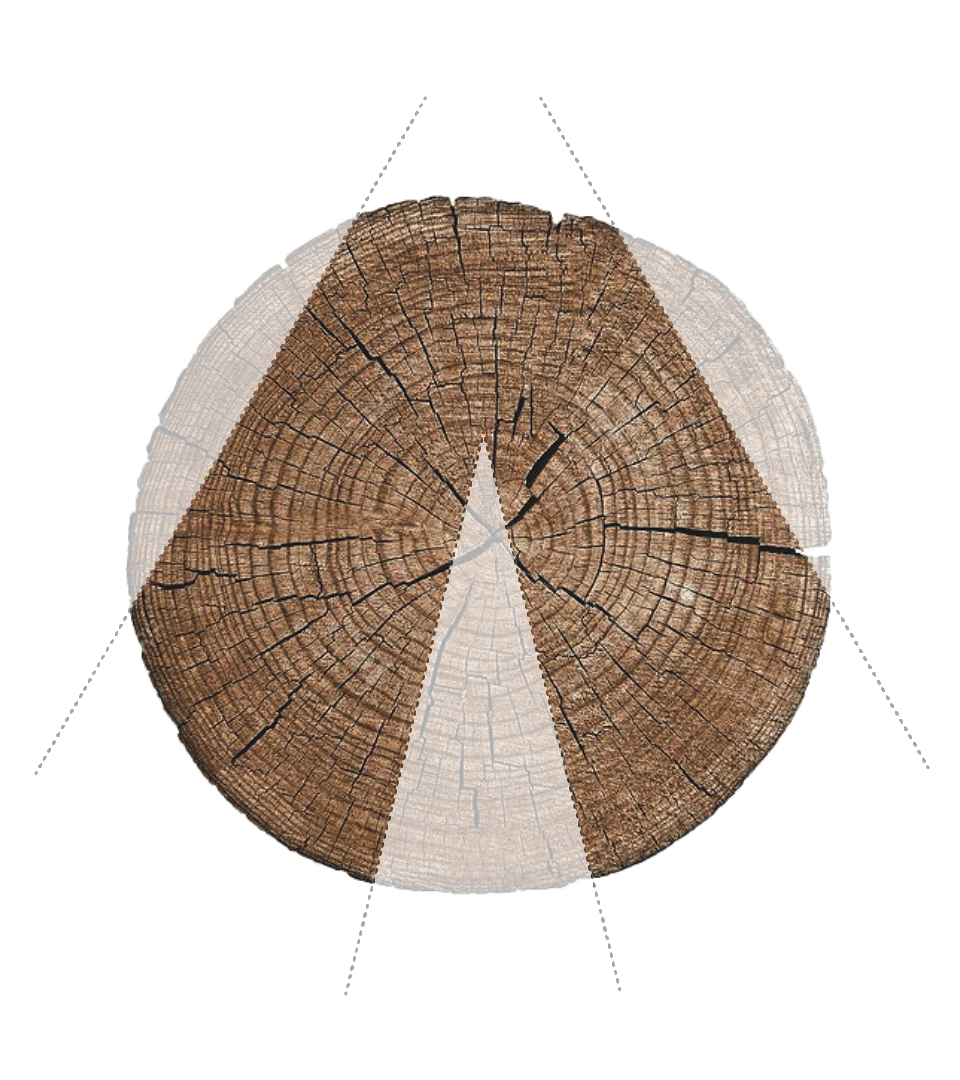
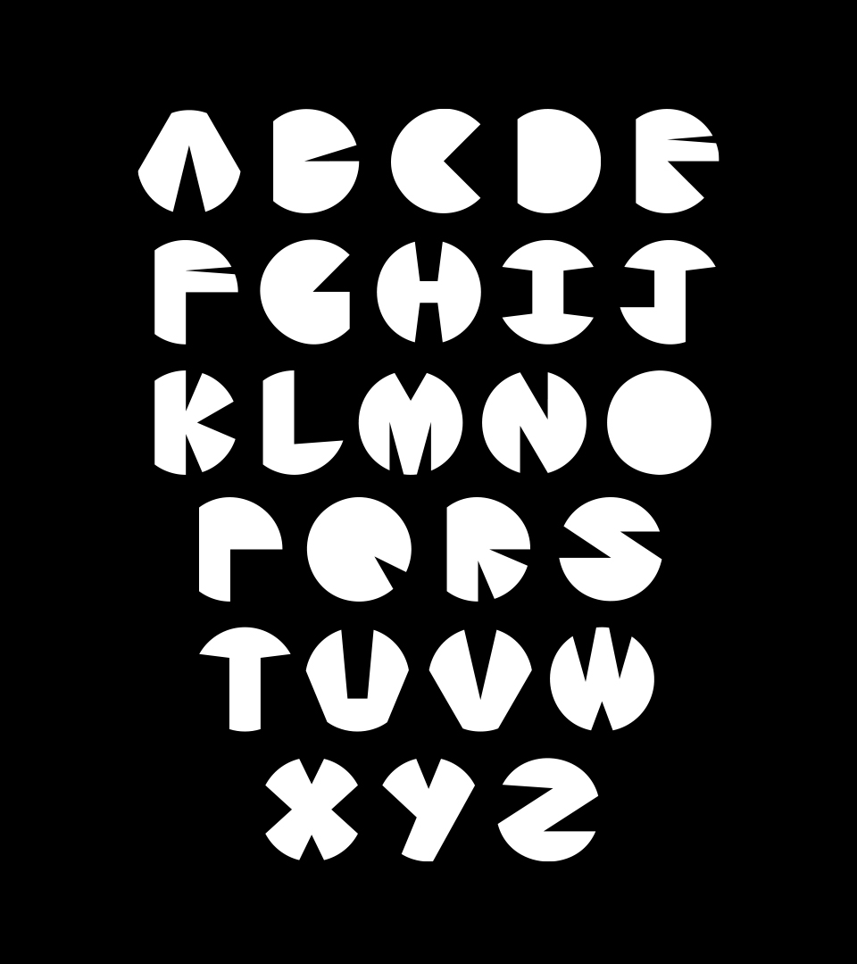
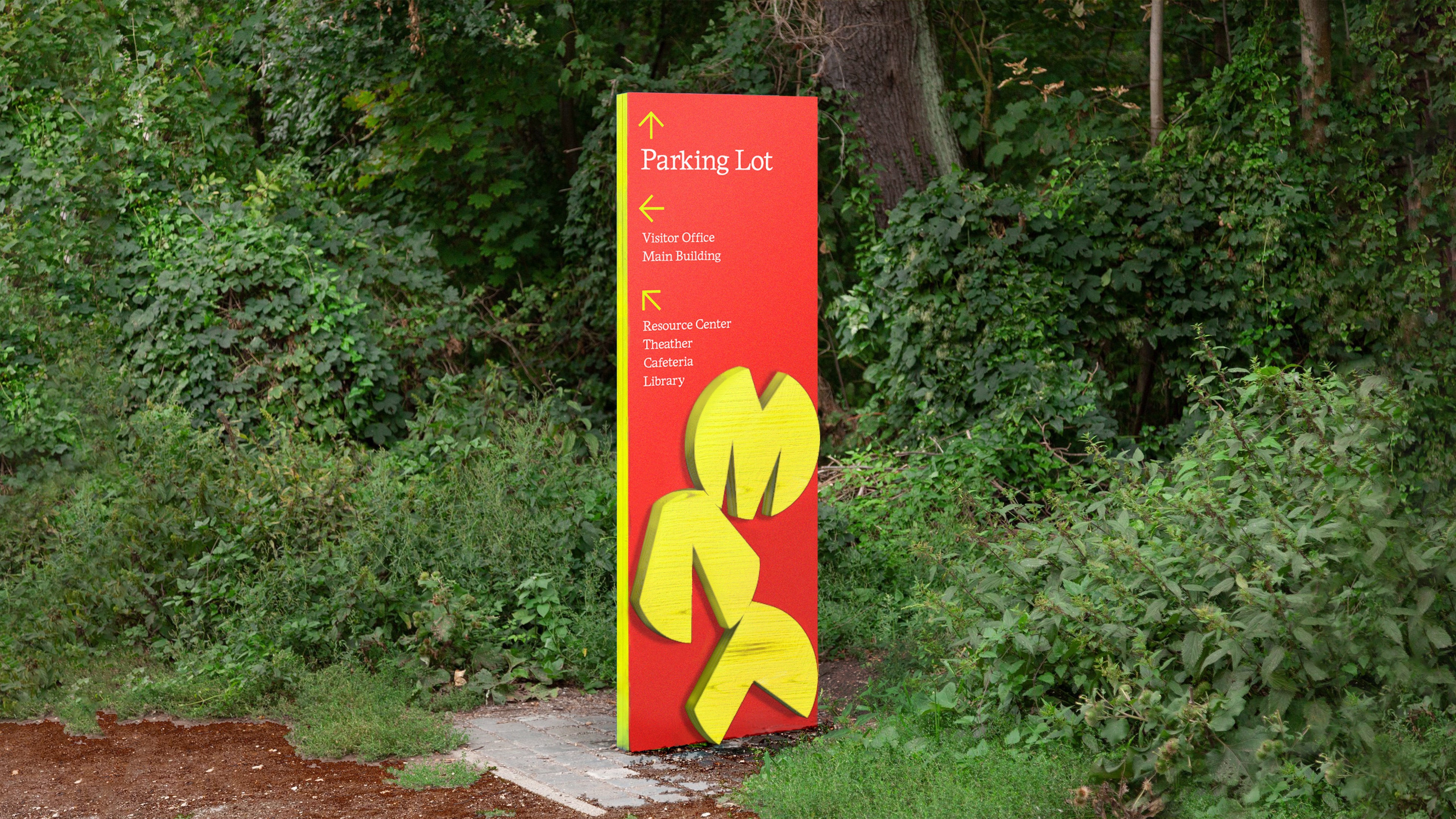
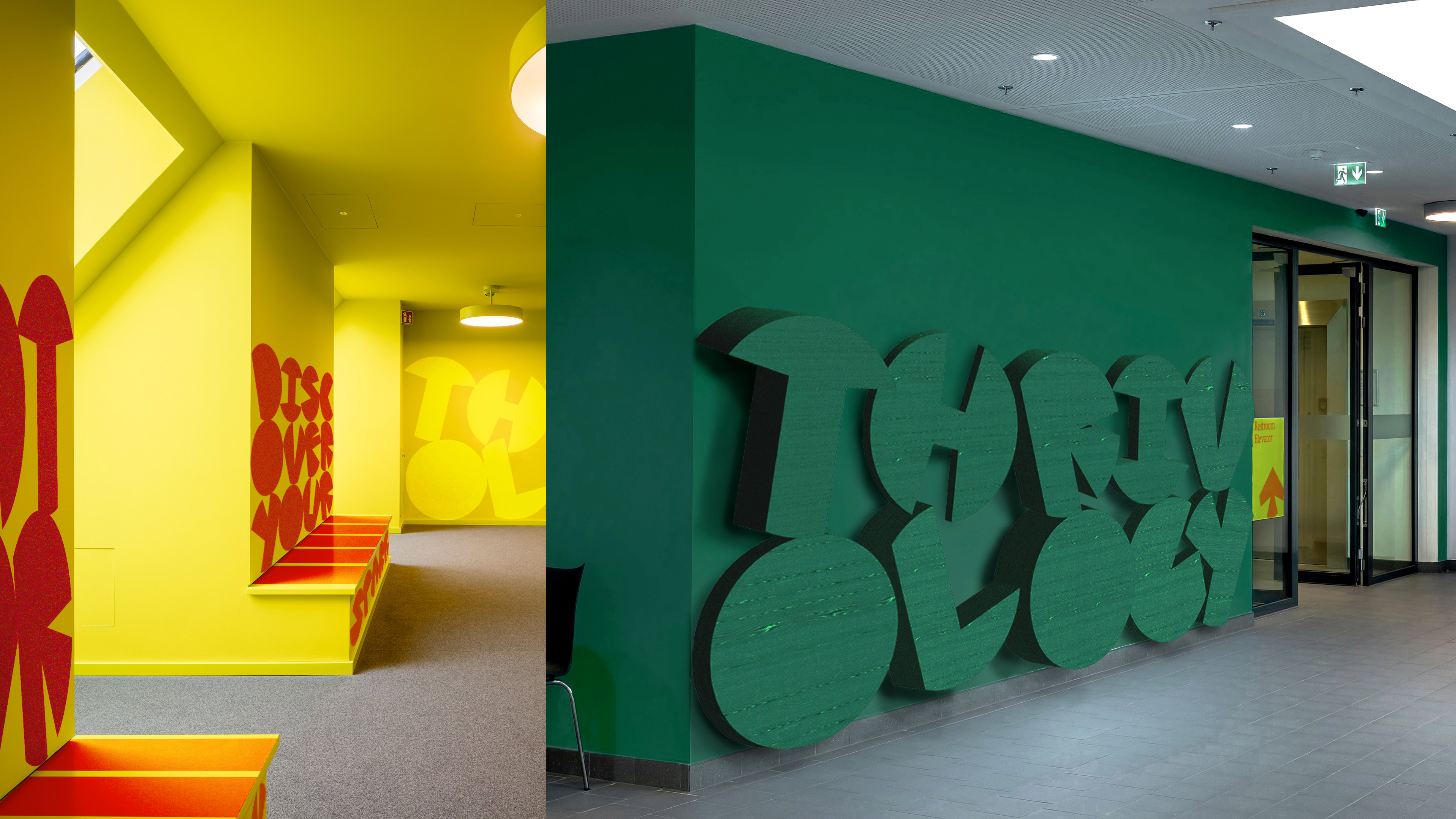
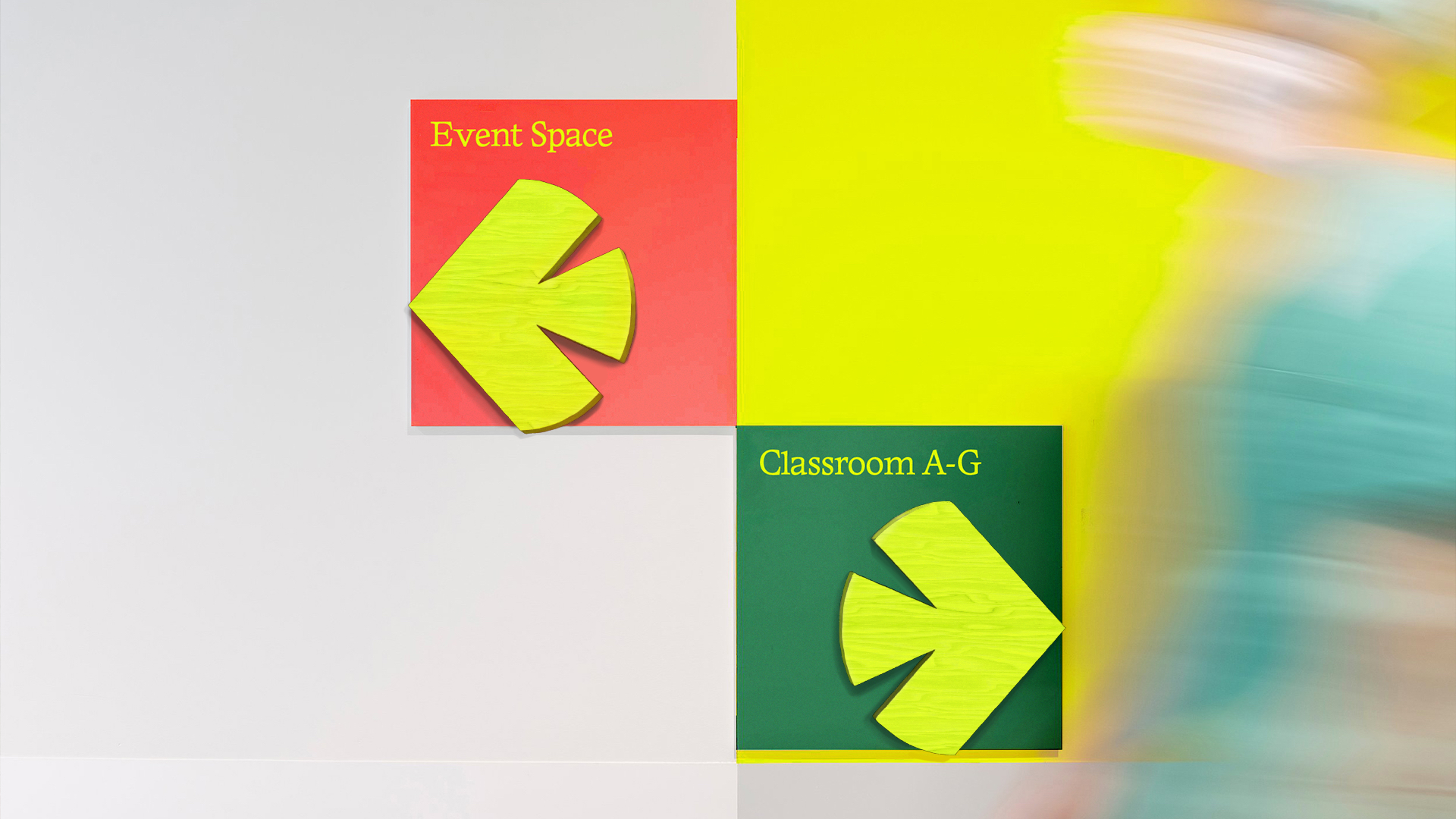
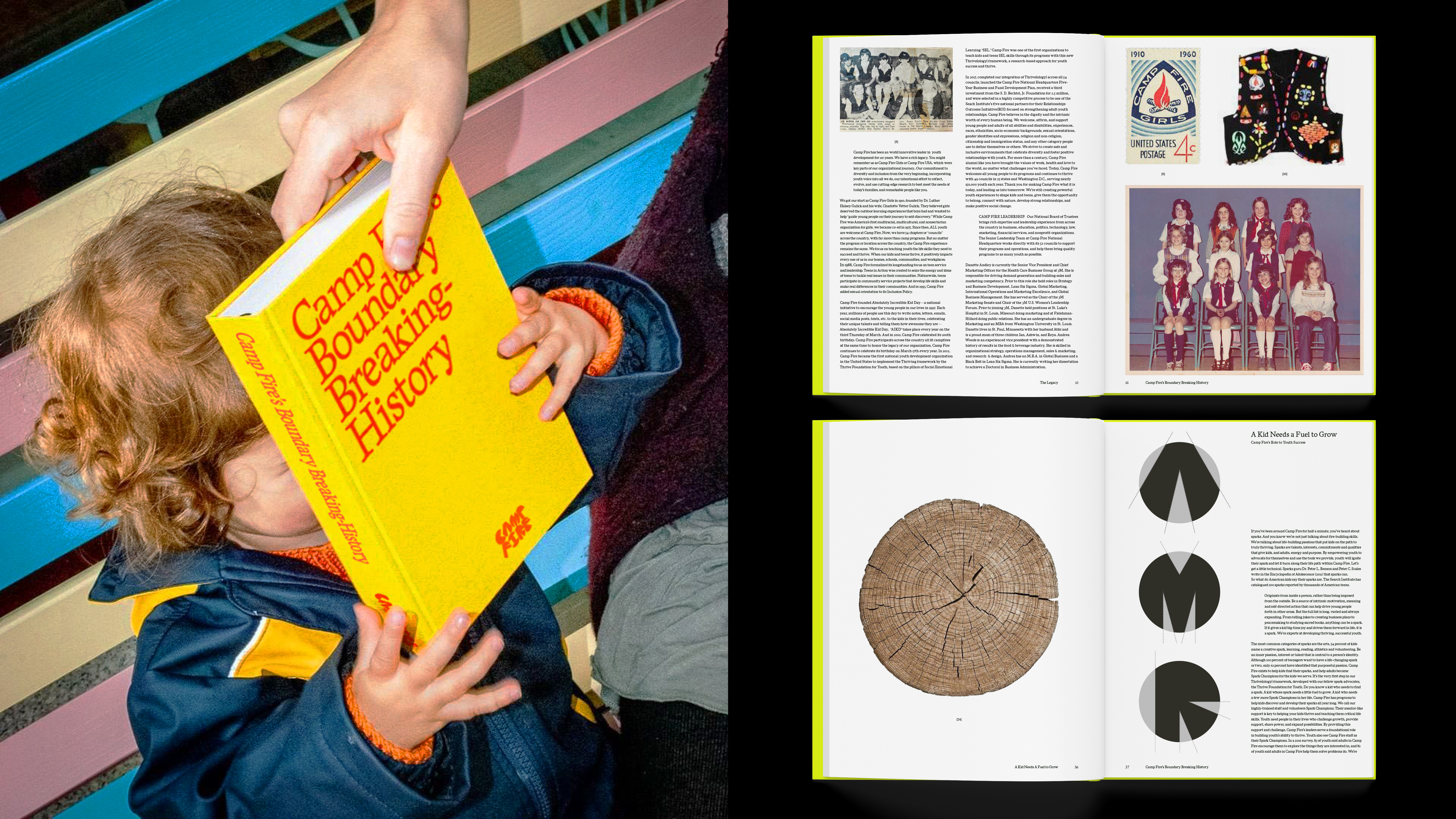
Camp Fire is a nonprofit organization that offers innovative youth development programs and leadership camps to help youth thrive. This is a rebrand of Camp Fire’s identity with new typographic and visual systems, including a new logo. Based on their mission and vision, I saw Camp Fire as “fuel” for the youth to light their spark into a blaze and keep the fire alive along their life path. The custom typeface is built based on the graphic forms of stacked wood fuels with a motion behavior of letters falling and piling up.


Campaign Design for Donors
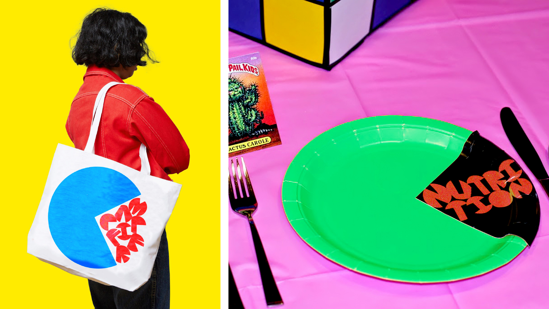
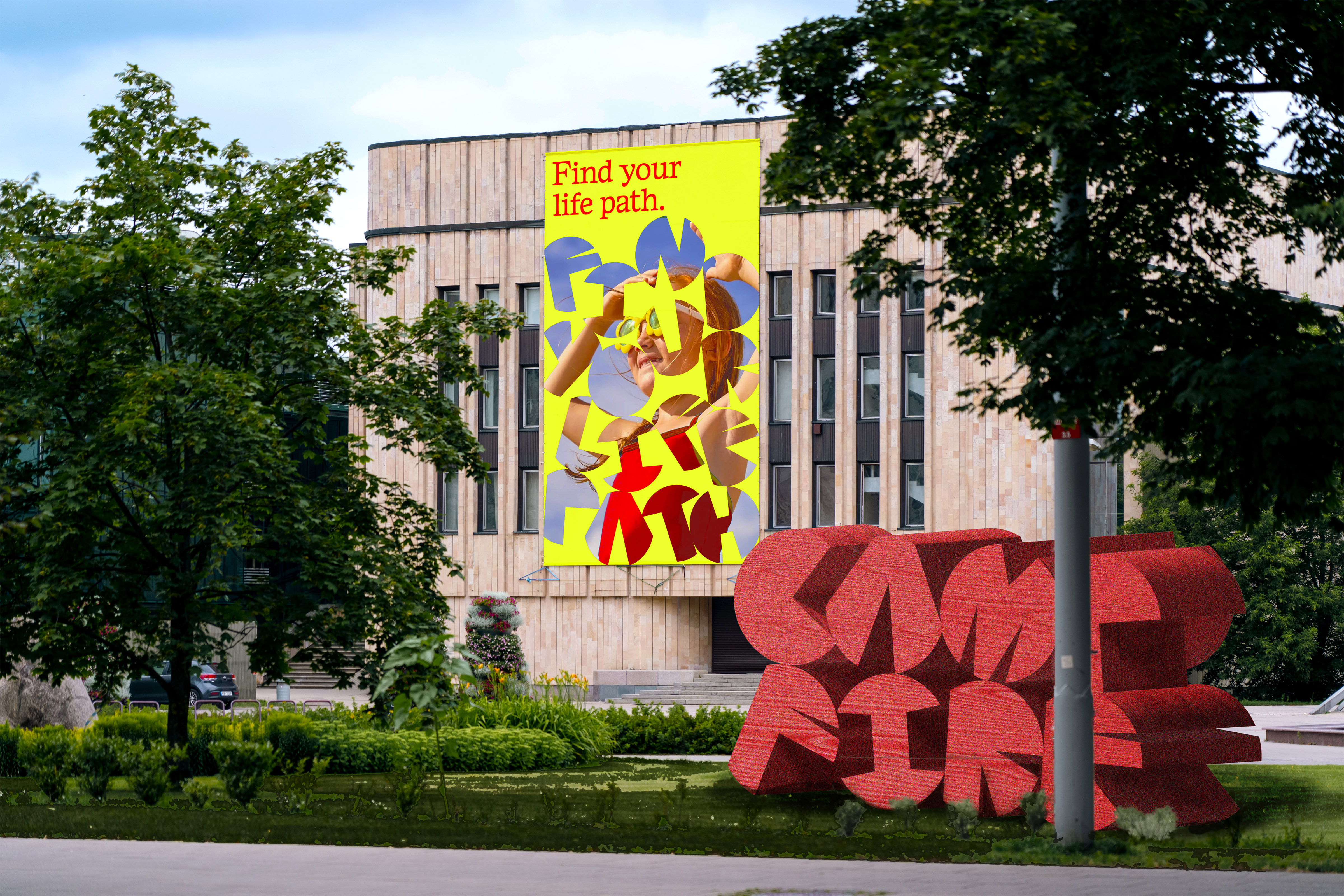
Our youth is our future. Therefore we should always care for and support youth to thrive. The campaign aims for motivating donors to offer young people opportunities for a better life path through their financial support. By shifting the letter "C" of the logo into a Pac-man, the new campaign logo speaks as a metaphor for youth intaking diverse experiences provided by Camp Fire and its donors.